Muji Style
14 Apr 2021 | Tip & TrendsMuji style in interior design originated from the Japan Retail Store, Mujirushi Ryohin, which translates as “ no-brand quality goods”. Founded in 1980, the core philosophy in Muji is beyond minimalism, it’s also about quality, functionality, aesthetic and environmental friendly, with a hint of Japanese Zen influence.
Simplicity is the ultimate form of sophistication. However, simple and uncluttered is not as effortless as it seems. Focusing on ‘ good enough living” by eliminating unnecessary details and patterns, opting for basic and simple form and shapes. Indeed, it takes real skills to achieve the perfect Muji look without being dull and uninspiring.
These are some essential elements in Muji-style aesthetics
01.
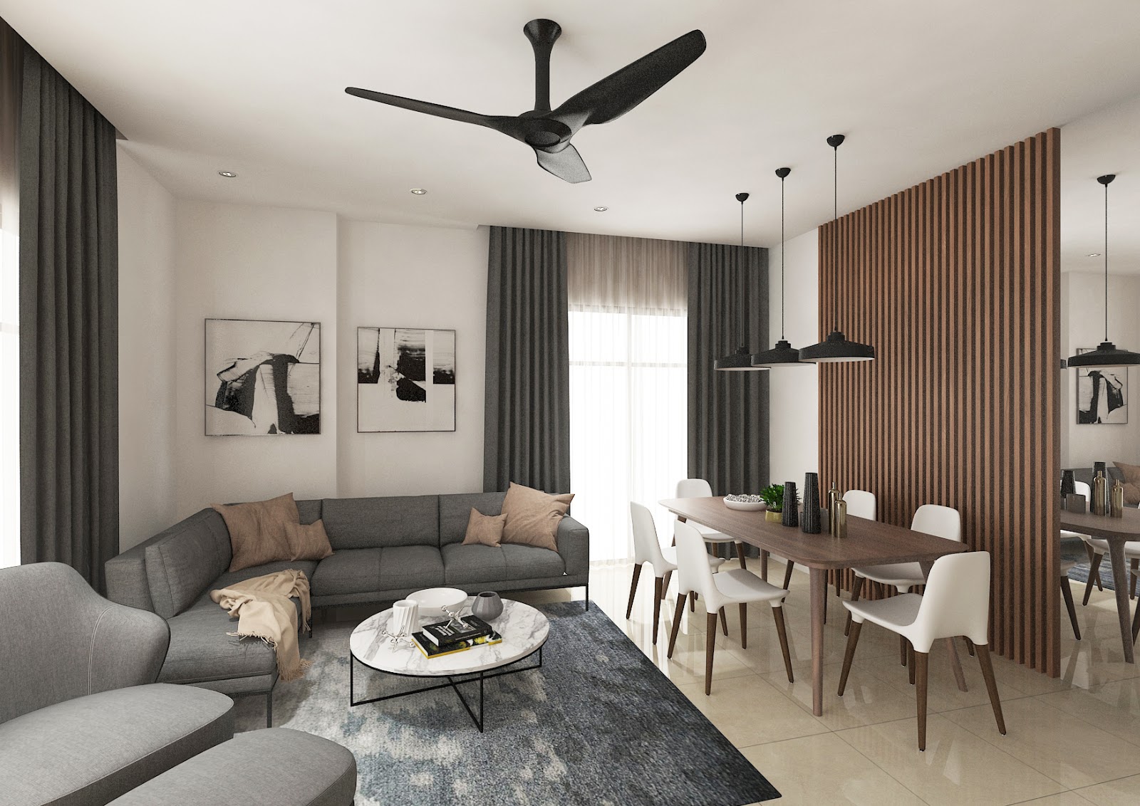
No frill open space - living and dining area.
Open concept integrates the living with dining space perfectly.
Wooden elements are utilised on a white palette for a clean and neat look.
Grey ascent from the sofa, curtain and rugs offers an inherent calm sophistication.

02.
Enhance a Zen living room with unique decor.
Feature wall in the living space is made of the signature wooden palette.
The vintage standing lamp adds a touch of Zen ambience.

03.
Signature trio color for bedroom.
Trio colour of oak brown, grey, white is the signature Muji combination, enhanced with grey and blue ascents. Furnitures are placed in a streamlined and sleek manner, giving a tidy and clean look.


04.
Splash of colour give a fun twist to the bedroom.
To spruce up the neutral and earthy space, you can always add some unique decor like turquoise bedside lamps to give a subtle elegance.
05.
Pristine white cabinet with wooden shades.
Cabinets are decked entirely in whites and wooden palettes,establishing a harmonious and stylish Muji vibe. Alternating closed and open storage encompasses both sophistication and practicality.

06.
Live up with a touch of greenery.
To have uniform colour coordination, all shoe cabinets, bookshelves and wardrobes are predominantly wood and soft-white palette. A potted plant instantly delivers a sense of tranquility to the natural and plain space.

07.
Wooden panel and full length glass door as dividers The mirror glass door divides the kitchen and dining area while keeping the cooking fume within the kitchen. Glass door allows sunlight to stream into the space and makes the space look more spacious.
Wooden panels act as both divider and backdrop of the dining area, creating a cosy and meditative Japanese Zen ambience.

08.
Well-designed and practical kitchen.
Streamlined and stainless steel electrical appliances blend seamlessly to the classic white and pale brown Muji kitchen.
Full height cabinets and vertical storage keep the space look uncluttered and tidy.


09.
Sleek and neat study and workstation.
Minimalism is to make every inch of space count, these thoughtfully organised shelves and box storages clearly emulate an aesthetic Muji vibe.

White blinds stand out against pale wood flooring and brighten up the space.
This study room can be a workstation or reading corner, with a sense of peace and rejuvenation.

In a nutshell, Muji style is a fine art of balancing between aesthetic and functionality. The principle of design thrives on modesty and quality, focusing on reductive and uncluttered elements, simple and clean lines, to build a timeless and elegant space.
 Celebrating life with interior design.


